#stampinup
It’s time for a new Stampin’ Up! catalog and time for a trip around the Creation Station blog hop. The design team is showing off all their new products from the new catalog and our theme is Father’s Day.
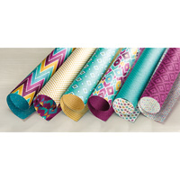
I have to start off this post with an admission: I apparently did not order enough from the new catalog with my preview order. I got ALL the new ink pads, reinkers, card stock, markers, and a package of the new Bohemian Designer Series Paper. I got the Banner Triple Punch (which is fabulous) and two stamp sets: “I Think You’re Great” and “Layered Letters Alphabet.” A good start, but certainly not enough stuff (which is why I’m a Stampin’ Up demonstrator–I want it ALL!!!)
So, I’m making do with what I have–and it’s all good.
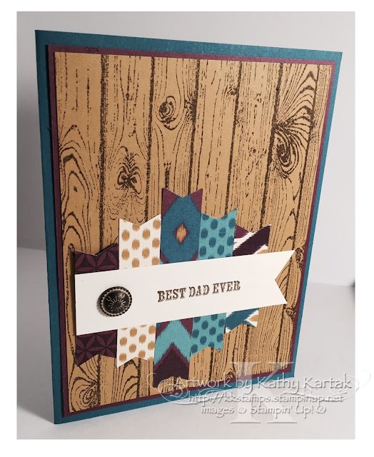
My first project is a Father’s Day card. I started with some 1/2″ strips of the Bohemian Designer Series Paper and flagged the ends with the Banner Punch. I adhered the strips to a scrap of cardstock, so they wouldn’t move around.
Next, I cut a 1″ strip of Very Vanilla card stock. I used the Banner Triple Punch to flag the end and then I stamped the sentiment from “And Many More” in Soft Suede. I adhered this to the flag piece and added an Antique Brad.
I cut a 4″ x 5-1/4″ (approx.) piece of Delightful Dijon and stamped the “Hardwood” background stamp in Soft Suede. I added a Rich Razzleberry mat behind the Delightful Dijon piece and adhered everything to an Island Indigo card base. For some reason, the card feels “cowboy” to me.
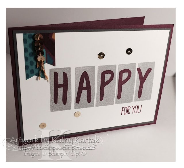
Next, I thought I’d use the fun new alphabet set “Layered Letters Alphabet” that everyone got on the pre-order. Man! It was hard coming up with something different than everyone else. My card is still derivative, but I think it’s got a bit of uniqueness.
I had some leftover Bohemian DSP flags, so that set my color scheme. When I went to my card stock stash, I found a lengthwise pre-cut piece of Rich Razzleberry….and it had a panel of Basic Gray already attached. Hookay…I can work with that. (Too lazy to cut another piece…)
I cut a Whisper White panel and stamped the word “happy” slightly off-set because I knew the banners would hang down. I used one block for the H-A-P; cleaned the stamps; and then used the block for the P-Y. It’s so nice to be able to see through the photopolymer stamps. The sentiment is stamped in Rich Razzleberry ink and the rectangles are stamped in Smoky Slate.
I wanted the card to say “Happy for You” because I’ll probably use this as a graduation card and I pulled out the “Work of Art” stamp set only to realize that the stamps in that set said “just for” and “you.” Ugh. But, a happy surprise–the “For All Things” stamp set has a stamp that says “grateful for you.” So I used a Rich Razzleberry marker to color just the “for you” part of the stamp and, eureka!!
I thought I was finished until I noticed a tiny bit of smutz at the top of the sentiment. It wasn’t ink. IDK what it was. So I hid the smutz with a few gold sequins…and added a gold sequin streamer to the banners. I love happy accidents!!
You can continue hopping around the blog by using the “next” and “back” buttons. I know our Creation Station design team have some wonderful projects for you!







Great cards, Kathy! I had a good laugh at your 'I didn't order enough' – I felt the same way with my first order; which is why I've already completed a 2nd order! You did great with what you had 🙂 Thanks for sharing!
Great cards–love the colors–the bohemian colors are quickly becoming my faves!!
Wonderful use of the new Bohemian designer series papers. I wouldn't have thought of those colours for a male card but your design here works really well.