#stampinup #faithfulinkspirations #ublueunwind I’m a Stampin’ Up gal through and through. I know there are plenty of amazing stamp and ink companies out there, but I stick to the one company I started with. I fell in love with Stampin’ Up because everything coordinates so well together–the stamps, the framelits, the punches, the inks, the cardstock, the designer series paper, the embellishments. I love it when things match–that makes it so easy for me to design and create. I’m not at all saying that other companies don’t do the same–but I started with Stampin’ Up and Stampin’ Up has always met my paper crafting needs.
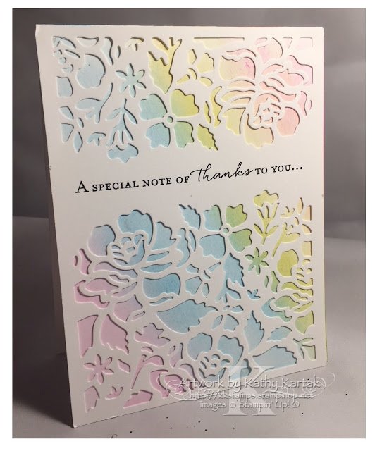
So, today’s card is out of the norm for me. I does use some non-Stampin’ Up products, but, I’m going to tell you how to re-create this card with Stampin’ Up schtuff. So let’s see this beautiful card that was designed by Pam Dye and that we made at the shoebox swap at Lydia Fiedler’s Unwind Retreat.
For this card, we brushed three pastel colors of distress inks onto a Whisper White Card Stock card front. If you’d like to re-create it, I suggested softly sponging on Powder Pink, Balmy Blue, and Pineapple Punch Classic Inks. Overlap the pink and blue to get some purple; overlap the blue and yellow to get some green; overlap the yellow and pink to get some orange. Easy peasy!
Pam had precut a 4-1/4″ by 5″ Whisper White overlay using the Detailed Floral Thinlits Dies. We stamped a sentiment from the matching “Floral Phrases” stamp set in Basic Gray Ink onto this piece. I adhered my detailed overlay to the card base using strategically placed Glue Dots.
This card is gorgeous. I’m so glad Pam gave us the parts–and technique–to make it!! Now you get out your supplies and make it, too! If you need to order the supplies, just click on the thumbnails below and you’ll go straight to my Stampin’ Up online store!
Product List


Leave a Reply